|
Aditya Kumar Oodles

Aditya Kumar (Design-Lead UI/UX Designer)

Experience:8+ yrs

Aditya is an proficient UX/UI Designer who excels in the field of UI/UX. He has a demonstrated ability to design products that deliver a comprehensive user experience. Additionally, he possesses a strong background in team management, leadership, and project management. He has worked on diverse projects spanning multiple industries, including Blockchain, Food, Healthcare, Education, Fintech, and ERP Dashboard. Aditya utilizes industry-standard tools like Figma and Adobe XD to bring his designs to life. His expertise and attention to detail make him a valuable asset in delivering impactful user-centric designs.

Aditya Kumar Oodles
Aditya Kumar
(Lead UI/UX Designer)

Aditya is an proficient UX/UI Designer who excels in the field of UI/UX. He has a demonstrated ability to design products that deliver a comprehensive user experience. Additionally, he possesses a strong background in team management, leadership, and project management. He has worked on diverse projects spanning multiple industries, including Blockchain, Food, Healthcare, Education, Fintech, and ERP Dashboard. Aditya utilizes industry-standard tools like Figma and Adobe XD to bring his designs to life. His expertise and attention to detail make him a valuable asset in delivering impactful user-centric designs.

LanguageLanguages

DotHINDI

Fluent

DotENGLISH

Conversational

Skills
Skills

DotExplainer Videos

100%

DotPhotoshop

100%

DotAfter Effects

40%

DotMobile App Interface Design

100%

DotUI/UX

100%

DotInteractive Prototyping

100%

DotFlexClip

60%

DotAnimation

80%

DotAdobe XD

80%

DotUI

100%

DotLogo

80%

DotFigma

80%

DotIllustrator

80%

DotWireframing/Prototyping

100%

DotUser Flows/Information Architecture

100%
ExpWork Experience / Trainings / Internship

Apr 2018-Present

Lead UI/UX Designer

Gurugram


Oodles Technologies

Gurugram

Apr 2018-Present

Mar 2017-Mar 2018

UI/UX Designer

New Delhi


Technobrix

New Delhi

Mar 2017-Mar 2018

EducationEducation

2015-2016

Dot

Oxford Institute

Multimedia Course-Graphic, HTML, CSS, User Interface, User Experience

certificateCertifications
Dot

Multi-Media Design

Oxford Institute

Issued On

Feb 2016

Top Blog Posts
7 Ways to Effectively Represent Your Brand


What is a brand
 

A brand is an identity symbol, mark, logo, or name that companies use to distinguish their product from others. A combination of one or more of these elements can be utilized to create a brand identity.


Also, Read | 6 Simple Tips for Designing Better Dashboard


Timeless and Memorable Logo
 

A logo is perpetually refined and adjusted for a brand, and in turn a brand must match and complement its logo. Your brand is primary to your complete identity style. It is the piece of your brand identity that is exposed to people. It lines up with all the alternative parts of your complete identity, additionally attributable to the broader emotional charm of your brand. For example, take a glance at these brand logos:


They're simple and instantly recognizable. Coca-Cola, Disney, and Google logos are simply a line of text with a single font, with no graphical elements surrounding it. Reputed logo design services can assist your brand with a timeless and memorable logo. Sometimes when a brand isn’t represented well enough, the client asks for a bigger logo. We can represent a bigger logo in the product in that case.


You might also be interested in reading: User Persona: Why and How to Use it


Now let’s look at the 7 ways or aspects through which we can effectively represent a brand:


1. Brand Colors


Colors are an extremely important design fundamental in your UI. Colors do not only increase the overall experience and influencing decisions but also represent specific brands. Colors are associated with the logo to form a part of the brand.


2. Brand Assets


One of the first brand associations a user will perceive in a digital product is because of the logo. Brand assets are part of the branding and are applied on the different types of online and offline communications. The logo is fundamental to creating associations for the overall experience. collateral design services also assist greatly in delivering amazing brand assets to elevate the brand. 


3. Typography


Typography speaks for itself and is one of the most fundamental elements to represent a brand UI. You can be super flexible using a font family depending on the context, but confine the typography in the same formats. Global brands confine themselves to single font formats.


4. Global look and Feel


The Global look and feel is definitely a cool way to represent your brand in UI. Does it look serious with simple shapes? Or does it look youthful with abstract shapes and dynamism? Simple but important details make the whole difference.


5. Brand Voice Tone


Is your Brand friendly, serious, modern, youthful, or corporate? The way of copywriting assists not only to convey the message better but also to identify the brand quickly. Use the same style and voice tone for your headings, paragraph, and CTAs. It is  always a winning formula.


6. Illustrations and Icons


Illustrations are a great way to level up your brand and design. By working with colors, shapes, thickness, and details you can develop your own illustrations style. These styles can be associated with your brand again. Developing your own illustration style will enable you in storytelling communications.


7. Create a Brand Mascot


Building a character around your brand can be super friendly and recognizable for your users. Common usage of character in designs include Freddie in Mailchimp and Luxo Jr. in Pixer. Those characters guide through specific flows.


Conclusion


In this blog, we discussed about the effective ways of representing a brand. I hope you’ve learned something from this post and found useful tips for your design skills.

Brand identity design services at Oodles establishes a distinct brand identity with a spectrum of visual design elements. From designing a logo to creating marketing collaterals, their designers are proficient at capturing your brand values.

Guidelines for Perfect Mobile Design
While designing Mobile applications we should take care of the small things because those small things make a good User interface. I am sharing some of the basic mobile design aesthetics which we all should use for better results.  

There are following points need to take care while mobile design:


Reach Area 

Thumb Reaching Zone: How easy to reach our thumbs to tap areas on a mobile phone's screen.

Hard to reach 

Reaching this area requires uncomfortable finger movements and a lot of stretching 

Okay to reach

Reaching this area requires some stretching. Can be hard for users with small hands

Easy to read

Reaching this area is very easy on nature and does not require stretching.

Platform Guidelines 

We have to use the right design system for iOS and Android. Both iOS and Android have a different user base. Also never carry UI Elements from e platform another.

Apple's Human Interface Guidelines

We are already aware of the In-depth information and UI resources to designing pixel-perfect applications to integrate seamlessly with the Apple platform

Guidelines Material Design

Material design is an adaptable system of guidelines, components, and tools that support the best practices of user interface designs for android. Think device first First, we have to be aware of the “unsafe areas” (notch, camera punch-hole, etc.)  

Unsafe Area 

Be careful when designing in these areas, you should not include menu or tab elements in there.

Safe Area

Everything within the “safe areas” will be visible on different device screens.  

Font Type and Font Size

Every font can evoke different emotions and provide easy readability at the same time.

Typeface

We have to choose a typeface that works well in multiple sizes and weights to maintain readability and usability in every size

Font-Size

Use legible font size. The text should be at least 11 points so a user can read it at a typical viewing distance without zooming

Contrast

Use contrast checkers to prevent color problems, also use 60-30-10 rule which refers to an ideal proportion that is meant to reach a balance among colors

Call to Action (Buttons)

We have to design finger-friendly buttons because Mistaken taps often happen due to small touch controls Create controls that measure a minimum of 10-12mm (40px) in order that they are often accurately tapped with a finger.  
Read more: How To Enhance Your Website's UX Design For Ultimate Conversion Rate?

iOS

Apple recommends a minimum target size of 44 pixels (px) wide 44px tall.

Android 

Google recommends a minimum target size of 48 dp wide 48 dp tall

Long Scroll Problems

Keep screens as short as possible, using cards with a tap to extend feature or by breaking tasks into screens

Tab bars

Tab bars are very important for every app, We have to design clear and clean tab bars also name all tabs whenever possible for better user experience.

Gestures

Tap or swipe mobile gestures? It is very important to choose the right gestures because if sometimes using the wrong type of gesture can lead to a broken UX.

Tap Gesture

Select or submit Activate Toggle on/off Cancel or escape Enable or disable

Swipe Gesture

Scroll Pan Dismiss notifications Refresh Paging

Conclusion

In this blog, I have mentioned a few important rules for perfect mobile design to improve design skills. I hope you've learned something from this post and found useful tips for your design skills.
Category: Design
User Experience UX VS Brand


User Experience and Brand identity are both important

Both disciplines are research-heavy: User Experience and branding involve research that includes user personas, quantitative and qualitative research, and User journey maps.


But how do they differ?

User experience is typically about the soul of a product. Branding is about the soul of happiness.


Brand

A brand is a subjective perception of value based on the sum of a person's experience with a product or company that ultimately influences that person's sentiments and decisions in the marketplace.


User Experience 

As a user's experience of the company, product, or services. Total-experience should encompass all elements of a UX design along with more classical elements of brand design. The visual design of a product is a translation of the brand's language to the interactive digital world
 

UX Shapes a positive brand experience 

A Branding can inform UX and UX can define a branding
 

Customer Experience is now considered a key metric to live brand success. As for UX designer's when performing on a brand that has already been defined, you ought to bake it into the user experience

On way to start connecting branding with UX is to apply brand attributes to interaction. Disney is one of the examples of how they use their brand attributes to inform their interaction.

Disney Brand attributes: Magical, Playful, Charismatic

A magic brand is one of the examples that Disney applies brand attributes through UX. At the resort, the MagicBrand doubles as a room key, ticket, and itinerary master. More intriguingly, the MagicBrand also functions as a payment device. With a tap, souvenirs and dining purchases are logged and changed to your guest room.


How to combine Brand and User Experience

Combining branding and user experience starts with a firm understanding of both the brand and the users. In addition, to provide a streamlined experience for the user, the communication between the brand team and user experience are indispensable.


User Experience is a brand, differentiators

Brands that choose to address an unmet user need at the core of their business are regularly disrupting industries by focusing on user experience. Specifically, on unmet users, needs as a brand differentiator and succeeding in oversaturated markets by doing so. Example: Uber, Airbnb, and Netflix


User Experience is a key to branding

Today's brand is viewed as the total of experience while the user interacts with the brands. Every opportunity a user gets to interact with the brand is an opportunity for the business owner to make better brand Image


Conclusions

In this blog, I have mentioned the difference between user experience v/s Brand. I hope you've learned something about user experience v/s Brand from this post. Our UX research consultants at Oodles Studio conduct in-depth research about the digital requirements of your business. Our UX research services include User Persona Development, Competitive Analysis Reports, Information Architecture Diagrams, and other UX reports. Talk to our UX/UI design team to build intuitive and effective digital interfaces for your business.


Category: Design
Some UX Terms Every Designers has to know

UX Terms


Some of the terms that a UX designer must know are:


  1. 3 Click Rule
     
  2. 5 Second Test
     
  3. Accessibility
     
  4. A/B Testing
     
  5. Card Sorting
     
  6. Diary Study
     
  7. Design Thinking


1. 3 Click Rule
 

Click rule is a very important Rule for websites. The users will leave a website if they can’t get to the pages they want within 3 clicks
 

2. 5 Second Test
 

5 second test involves showing users interface of software application or a website for 5 seconds. The participant then has to recall when they saw on the page. This is a great method to see whether the key visuals or a call to cations have been corrected impact.
 

3. Accessibility
 

Accessibility is the ease with which people can use and understand a website and apps. This also refers to how websites and apps are adapted for those with disabilities or special needs. An example of this could be adapting colors to allow for people who are color blind.


Also, Read | Most Significant UX Elements For An Ecommerce Store


4. A/B Testing
 

A/B Testing is when you test two different versions of online content with users to see which one they prefer.


Related 
A/B Testing In Digital Designs | Benefits, Risks And Steps


Check out our UX research services for more.


5. Card Sorting


Card Sorting is a method used to help or evaluate the information architecture of a site. In the card sorting sessions, participants organize topics into categories that make sense to them and also may be asked to label these groups. To do a card sort, you can use cards, pieces of papers, or an online card sorting tool.
 

6. Engagement (User Engagement)
 

User engagement is about getting a user’s attention and keeping it. Anything in design that helps a user stay focused on a page or a screen (whether it be a button or a menu) is crucial.
 

7. Diary Study
 

A Diary Study is a research method used to collect qualitative data about user behavior, activities, and experiences over time. typically, user self-report their activities of regular intervals to create a log of their activities. The diary study can range from a couple of days to over a month.


Now, let's understand something called as "design thinking" in the field of design.
 

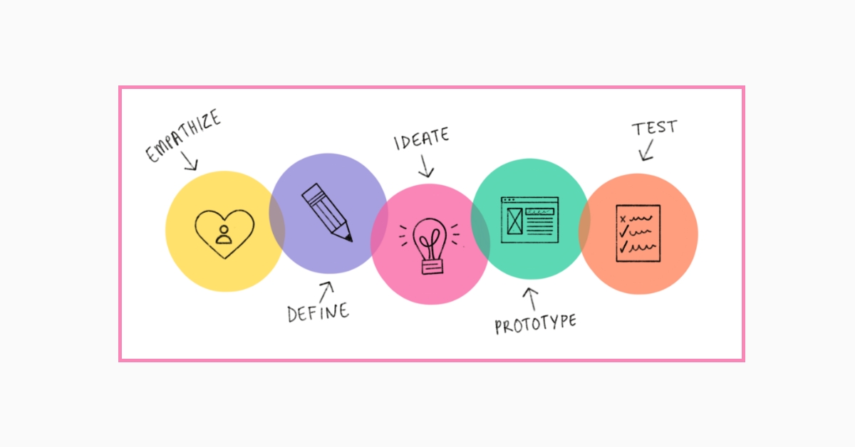
Design Thinking
 

Design Thinking is a process or an approach used for practical and creative problem-solving. For Every designer’s Design thinking is a way to define a problem, find a solution, build a prototype for their ideas and test. Get in touch with our UX UI consulting services for assistance.

There are five phases of a design thinking process

  1. Empathize (To understand the design challenge)
  2. Define (Define the design problems)
  3. Ideate (Brainstorm and get the solutions of problems)
  4. Prototype (Build your design with solutions)
  5. Test (Test your design)


Conclusion
 

In this blog, we discussed some UX terms to improve your skills in design. I hope you’ve learned something from this post and found useful tips for your design skills.

We offer UX consulting services formulating effective business strategies with user research and analysis.

6 Methods to Get better at UI UX Design

Get Familiar with design patterns

Design patterns are known as standard reference points, guides templates that designers might use to solve a particular problem when designing a website or mobile app, so you do not have to reinvent the wheel every single time trying to solve particular design problems.

Train your eyes for good design

As UI/UX designer you have to develop a keen eye for good visual design. You need to train your eye every single day-how? Go to Dribbble, Behance, Pinterest, etc. and study carefully top designers that inspire you-how they use white space, typography, spacing, color combination, etc. Save/Bookmark their designs and start creating your own inspiration library. Remember: Consistency is the key!

Learn by copying top designers

Copying is a very effective technique that painters, writers have been using for countries! Copying is about reverse-engineering breaking down top designer's work. Find designs you love and you are inspired by - and then literally start copying them! (pay attention to every single detail when doing it) Remember through - Its all about the practice, not plagiarism! You are not selling this stuff or placing it into your portfolio, this is only for your learning.

Apply what you’ve learned

Copying and recreating others will give you that good taste, so you will get a better understanding and idea how good design look like. Although, you need to know how to apply all your learning into real-world projects! If you do not have any freelance/commercial project to work on at the moment - just start working on the concept/fake one! How simple is that:)

Practice makes perfect!

Set up your daily designs routine to spend and practice at least a few minutes every single day consistency is very important! You will not become a better designer over the night-it’s all about practice - you need to keep learning and working hard every single day as that’s the only way you can improve. There is no shortcut: The more you do it- the better you’ll get it!

Find a mentor or mentors

Another great way to improve your design skills is to work under mentor/mentors. Their feedback is very beneficial as they will help you to spot every small detail that you weren't aware of your learning process, so what you’re waiting for then?:) go ahead and find a mentor- ask for their support and expertise in order to put your design skills into a higher level!

Conclusion

In this blog, I have mentioned a few important points to improve design skills. I hope you’ve learned something from this post and found useful tips for your design skills.

3 UX mistakes to avoid when designing for mobile

3 UX mistakes to avoid when designing for mobile

Mistake No 1 Not showing your users the correct keyboard Give users the right keyboard on mobile forms, typing is easy when users do it on a desktop. But it's to do on mobile device because not all the keys are visible on the keyboard at once. A small screen can only display a limited set of keys. Most mobile operating systems have designed separate keyboard optimized for specific form field inputs. These optimized keyboards are there to use, but most User Experience designer fails to test and guide their developer on triggering the correct keyboard.   Example   iOS keyboard There are mainly 4 types of a keyboard that can be triggered for different types of form fields, please see as an example the iOS keyboard option below.   Mistake No 2 Not understanding the importance of mobile button placement Button placement affects how fast users complete their tasks, placing your call to action where users expect to find them leads to faster task completion. When the user gets more done in less time, they're more satisfied. The first location to decide on is whether to place your call to action button at the top or bottom of the screen. Most users start by scanning the content first because it relates to their task. Their eyes move from the top half of the screen towards the bottom. When the content ends, they're looking for an action.   Mistake No 3 Using too many text button The usability standards for button are higher for mobile apps than desktop apps. It's easy to design text buttons on your interface because they don't take much effort to design. But the consequences of doing this are frustrated users who have trouble reading, recognizing, and tapping your button. Do not take the lazy way out and abuse text buttons. Your call to actions should always look and feel like buttons   Example Text buttons are harder to tap Text buttons are harder to tap because a finger is larger than a mouse cursor. Placing it over a smaller target feels awkward for users. Their finger covers the text of the button with no visual cue to confirm if the action registered. Text buttons are harder to recognize The difference between text buttons and text color. it makes text buttons difficult to recognize. Without a unique shape, users are more likely to overlook text buttons and miss the call to action. Take away Make sure you serve the correct keyboard on your form fields Understand the importance of buttons placement within the user journey, do not make your user think When you having a primary and a secondary CTA, always place primary action to the right which is more natural on the reading flow Try to limit the usage of text buttons as they make look nice but can be anti-user friendly
Category: Design
How to build a design system Before going forward! First, understand what is design system? A design system is the single source of truth, which groups all the elements that allow teams to design and develop a product that can be assembled together to build any number of application and design system include things like.
  1. Design Principle 
  2. Design Token
  3. UX guidelines
  4. Development Guidelines
  5. UI Patterns 
---- Remember UI kits is not a design system, It can be a part of a design system  Know the difference

What’s the difference between a style guide and a design system?

The design system is more complex than a style guide and style guide is a simple collection of colors, typography and other elements which can help to identify the brand. Most design systems is really just pattern Libraries: a big box of UI Lego pieces that can be assembled in near-infinite ways. Your product is just a pile of reusable UI elements. It has structure and meaning.   According to Atomic Designs There are so many benefits to creating a design system like
  1. Design System promotes UI consistency, allowing a user to get done what they need to get done
  2. Allows for faster production
  3. Allows for generating higher quality design 
  4. Established shareable vocabulary between disciplines and different products
  5. Make things easier to test UI
  6. It provides a future-friendly foundation to grow and involve the system over time 
  Focus on the right clients

How to sell a design system?

  1. Before providing a solution, understand do we really need a design system? If yes then why do they need?
  2. There are many types of client, you can offer them a design system
- Who are running the business in the last several years (2-5 years) - Who are trying to extend their business - Who have multiple digital products and now they are struggling with designs.
  • Don’t try to sell design system to startup, reason first they just begin and they didn’t scale their business so it is very hard to sell, into problems and challenges.
  • Lastly, understand the design system is a way to solve the design+business problems but you should find the right clients and right companies
 

How to define a design system

Understand the design system is not about working in isolation it’s all about collaboration! If you are working individually, you may start from creating style guides and It's a good start for an individual designer.
  1. Color (Brand, gradients, accents)
  2. Typography 
  3. Spacing
  4. Accessibility colors
  5. Content
And then you can start building UI components.

Building UI components Example

  1. Buttons
  2. Models
  3. Forms elements
  4. Data Tables
  5. On-off switches
  6. Dialogs
  7. Toolbars
  8. Checkboxes
  9. Dropdown menus 
  10. Sliders
  11. Steppers 

Conclusion -

In this blog, I have written a How to build a design system and difference between a style guide and a design system? And mentioned UI components like Buttons, models forms elements, etc. Being an user research consultant you should have knowledge of design system.
Understanding the Significance of Customer Experience (CX) Pyramid According to a Customer Experience Consulting firm, Walker study by 2020, indicates that 86% of the buyers will pay more for a better experience, rather than for a usual one. For future-proof companies, the Customer Experience (CX) is a key differentiator and will play a big role in redefining them. Therefore, providers of UX research services must explore multiple user research methodologies to study and analyze the customer's needs, expectations, motivations, and preferences.  How would you make your strategy a success? Which key performance Indicators (KPIs) contribute to the perfect experience and how do you measure those?

Definition -

Forrester Customer Experience Pyramid. The Customer Experience Pyramid measures customer’s loyalty in a logical order from the baseline essentials to more sophisticated business metrics
  1. Meets the need
  2. Ease of use
  3. Enjoyable Experience

Meets the Needs - Goal Completion 

The first stage of the Customer Experience (CX) Pyramid covers the basics: How effective is a company in meeting their customer’s needs? This stage goes hand to hand with the Customer Experience (CX) metric Goal Completion Rate (GCR) which asks the customer: Were you able to reach your goal?

Ask Question

Did you reach your goal today?
  1. Yes
  2. Partially 
  3. No

Ease of Use - Customer Effort Score

How easy was it for a customer to reach their goal and finish a certain task on the website? Customer Effort Score (CES) is an effective way of measuring it. The idea behind Customer Effort Score (CES) is that the organization create loyal customers when they find what they‘re looking for solving their issues quickly and easily.

Ask Question

How easy was it to do task X, Y, or Z?
  1. Strong Disagree
  2. Disagree
  3. Somewhat Disagree
  4. Somewhat Agree
  5. Agree
  6. Strong Agree

Enjoyable Experience - Emotional Score

You can use a client Satisfaction or Emotional rating question centered on however your users feel.  Why? A HubSpot Study found that over 80% of companies believe retention is cheaper than acquisition - keeping your customers happy pays off.

Ask Question

How enjoyable was it to buy from your platform?
  1. Very Unsatisfied 
  2. Very Satisfied
  3. Satisfied

Case Study -

How Amazon and Uber Rewrite Customer Experience (CX)

Amazon’s approach to Customer Experience (CX) was to start fresh and focus at the top of the Customer Experience pyramid.  Uber preferred Customer Experience (CX) of urban transportation, over the conventional way of measuring with existing taxi system’s customer complaints.

Conclusion - 

In the future, brands will not succeed because they have Customer Experience (CX) programs. They will succeed when Customer Experience (CX) is driven from the top, is integral to the culture of the company, which eventually guides the behavior, and the actions of all employees, most important needs of the customers for products and services are measured, and the satisfactory level as well. If you want your customer to have a good time engaging with your services, you need to start improving all three pain points.
How To Create Wireframes Using Tool To Save Time Wireframe "A prototype of a wireframe" In simple language, we can say wireframe is the first look of any website. It is just a black and white layout of a web page that used to demonstrate all elements, size, place of particular all elements, conversion areas and navigation for your website. Wireframe are is devoid of font size, the color of the website or other elements, logos. or any real design elements, despite focusing all these things it's purely concern with the structure of webpages

Few Benefits of wireframe

As we know wireframe is a layout of website individual webpage, that is a great advantage of wireframe because it provides an early visual that can be used to review with the clients. Once the wireframe approved by our clients and users, It provides the confidence to the website designer also it prevent a repetition of designing the same elements of web page

Best Tool for wireframes

There is a number of tools but you have to be specific for selecting a tool. Below are the best tool for wireframing. Which are being used by many wireframing and prototype design services. Wireframe offers a simple interface for sketching your wireframes. There's a limited color palette and UI elements are context sensitive and will show when you need them.

Adobe XD

Adobe XD is full of Adobe features which enhance the performance of designing and make a perfect balance. It openly offers to invert files form photoshop, artist, and sketch, etc. There are many tools, which can save your time because of AI

Sketch

The sketch is one of the top vector graphic editors. The sketch is the perfect tool when you're making wireframes, creating a style guide or drawing illustrations. It provides the facility to enhance your working method, collaborates together with your co-workers synchronize your artboard.

Conclusion

In this blog, I have written how to create wireframes using tool to save time. Wireframe "A prototype of a wireframe" In simple language, we can say wireframe is the first look of any website. It is just a black and white layout of a web page that used to demonstrate all elements, size, place of particular all elements, conversion areas and navigation for your website.    
Designer must know about different button for UI Designing In all over the world if two people want to communicate with each other, then the most important thing is medium. The medium may be any languages, symbols, gestures, etc. In the same manner for any user interface."Button" do the same thing. The button is most vital for the UI that provides a link between user and design. "Button lack your choices, just in a single click"

Few common buttons-

The most commonly used buttons are- radio buttons, submit, reset, etc. But if we talk about nature of button and their perfectly use then other is a list of that.
  1. Dropdown Button
  2. CTA Button
  3. Ghost button
  4. Expandable button
  5. Dynamic download button
  6. paddle Switch
  7. Realistic button
  8. Menu Button
Dropdown Button - With the help of the drop-down button, we display a drop-down list of mutually exclusive items, by clicking it. CTA Button - CTA- call to action you can use this button in the website to guide users towards your goal, conversion. Some examples of CTA
  1. Add to cart button
  2. Download button
Ghost button - We called it ghost button because it looks transparent and empty, also known as "empty" hollow. It covered by very thin line with plain text. Expandable button - It opens several options after being clicked or tapped. It provides the flow of interactions without any lead of screen. Dynamic download button - This is the new concept to design button, it is a combination of the download button and progress Bar. It reduces the waiting time of users to download the content of the webpage. Paddle Switch - This is one of the most creative buttons. It shows the sliding button with great visual effect. We can make it more effective and attractive with 2D/3D. Realistic button - You can design this button with a glowing effect. It is the most innovative idea to design buttons for websites and mobile apps for getting a number of clicks. Menu Button - It shows the drop-down options, also mark the switch menu button, is the best replacement of a dropdown menu that shows option one by one. These are the few best menus that can improve your design. Conclusion -  In this blog, I have written about buttons. The button is most vital for the UI that provides a link between user and design. The most commonly used buttons are- radio buttons, submit, reset, etc. Providers of the Ui Ux design services said these buttons gives attractive user interface design which are highly appreciated by their clients.  
Best Practice For A Design System And Why You Need One As we all know- "practice makes man perfect" which refers to the importance of practice in human life as it makes a man perfect. When we start learning something new it seems too hard in the beginning, especially when we are likely to struggle and makes mistake So practice is necessary for all area, and when we talk about designing a system it is compulsory, to get a perfect design. Here I have listed few Best Practice For A Design System:

Best way to practice

All foremost Ui Ux design studio invest lots of time and effort in the design system to provide the product with an attractive and consistent look.

Represent, Don't tell

Image, visuals design is the way that can provide a deeper explanation without using a single text. Instead of writing too much text you just show them by a single design to your website visitors.

Familiar Reinforcement action

It may possible that many new people visit your system, so your message and call of action should be the same. Suppose you have a gaming website, then you shouldn't change the call of action button from a page of page. Like:-On homepage:-Register Now Game type:- Check the game contact page:- Buy it now. This is not a good synchronization of design there is no reinforcement. point" that ensure only by practice-
  1. What to design-?
  2. How to design?
  3. How do I add a component?
  4. the specific requirement of a system?
  5. Client and user requirement?
There are many other points instead of this that we can identify only by practice. If we have enough practice we can collect all the needs of the user in one go, will get perfect design goal with too much effort.

Why practice is a necessity

A design system is not only a collection of components, elements, and assets that you can use to build any product. Ascending to Emmet Connolly, director of product design at the intercom, most design systems are really just a pattern libraries. Due to lack of practice, you may become unproductive an inconsistent, there are a few points that represent the need for practice in design.

Bad product decisions are made

A few years back it was the tradition that designers only responsible for all about the front-end and developer for Back-end. There was no collab & action b/w then also were not responsible for any breakdown in other side and the resulting product may not be flexible enough so awareness of designing and developing both and require for a good product for that practice is needed. Design System is endless and never really "Finish" it will grow day by day and agave just like any other product.
Understanding the Basics of Color Therory Most people think the choice of colors for UI depends on the designer's taste and sense of beauty. To create good design and colors combinations more effectively, you need to understand how colors are formed and how they relate to each other. Today, we offer you to remember (or maybe even learn) the basic of color theory about color combination which can be effectively applied in your design creating process. We have to remember these points.
  1. Color Plays a significant role in designs
  2. Color has a great impact on our mood and behavior
  3. The success of the product depends largely upon the color chosen for the designs
  Color Wheel I think you all must have seen the circle consisting of different colors this is called the color wheel which helps to understand how different colors relate to each other and how they can be combined. The color circle is built of primary, secondary and tertiary colors. The primary is three pigment colors that cannot be formed by any combination of other colors. Combining primary colors, we get the secondary ones, and the mix of the primary and secondary colors gives us the tertiary colors which usually have two-word names such as red-violet. Orange This is an energetic and warm color bringing the feelings of excitement. Orange color combines red’s power and yellow’s friendliness, so it may bring feelings of motivation, enthusiasm, and love to live. Designers use the Orange color if they need to give the spirit of creativity and adventure. Yellow Yellow is the color of happiness which symbolizes the sunlight, joy, and warmth. Yellow is thought to be the easiest color when it comes to visibility. It has one of the most powerful psychological meaning. Users seeing yellow colors in the design can feel inspiration and confidence. You need to remember that too much yellow may bring negative reactions such as the feeling of anxiety or fear. Green It’s called the color of nature, balance, and harmony. Green brings calming and renewing feelings. Also, it is a sign of growth and inexperience. It has more positive energy than other colors but sometimes it associates with materialism. Design in green colors perfectly suits the products connected with nature. Blue This represents some corporate images since blue is the color of trust. It usually shows reliability, may give users feelings of calmness. Designers need to keep it in balance. Pink This is the color of hope, sensitivity, and romance. Pink is much softer than red, so it creates a sense of unconditional love. Pink is very strongly with youthful femininity, so it may be an effective color if the target audience is mostly girls and young women Brown This is the color of security and protection like the Mother Earth. Designers mostly use brown as a background color in a variety of shades, from very light to deep. Brown color brings the feeling of warmth and comfort to the designs. Also, it may be used to show experience and reassurance. Black This color has a great number of meanings. It associates with tragic situations and also signifies mystery. This can be traditional, modern and serious. Everything depends on how you treat it and which colors go with it. Black matches well with any other color, so it’s ideal for the background. Designers often use it to set contrasts. White This is the color means purity and innocence, as well as wholeness and clarity. White often associated with a blank sheet of paper motivating people to generate new ideas. If, too much white can cause feelings of isolation and emptiness. In design, white is commonly used as the background color especially for the resources for which readability is a vital part. Conclusion In this article, I have written about the meaning and relevance of colors. To convey the right tone, message and call users to make the expected action, designers need to understand what each color mean and what reaction they evoke.
Few Essential Tips To Make Good User Interface A site is considerably more than a combination of pages associated by connections. It's an interface, space where diverse things — for this situation, an individual and an organization's or person's web nearness — meet, impart, and influence one another. That connection makes an ordeal for the guest, and as a website specialist, you must guarantee that experience is on a par with it can be.  UX experts delivering UX consulting services must understand user is the center of any UI design.  

Know your users

  Above all else, you need to know who your clients are—all around. That implies knowing all the statistic information your investigation app(s) can pull, yes. In any case, more imperatively, it implies realizing what they need, and what obstructs them accomplishing their objectives. Getting to that dimension of sympathy requires more than the cautious investigation of details. It requires getting to know the people who use your website. It means speaking with them face to face, watching them use your product (and maybe others), and asking them questions that go deeper than, "What do you think of this design?" What are their goals? How can a website help them resolve those challenges? Try not to stop at realizing what your clients need. Uncover further and find what they need. All things considered, wants are only outgrowths of requirements. In the event that you can address a client's profound situated need, you'll address their wants while also building the foundations for a good UX design. The bits of knowledge you'll reveal from investigating information and talking with clients will illuminate each choice you make, from how individuals utilize your interface to what sorts of the content you'll feature inside that interface.  

Define How people use your interface

  Before you structure your interface, you have to characterize how individuals will utilize it. With the expanding predominance of touch-based gadgets, it's a more essential worry than you may suspect. Individuals use sites and applications in two different ways: straightforwardly (by connecting with a component of the item) and by implication (by cooperating with a component outer to the item). Instances of direct connections
  1. ‍Tapping a catch
  2. Swiping a card
  3. Relocating a thing with a fingertip
  4. Instances of aberrant associations
  5. Pointing and clicking with a mouse
  6. Utilizing key directions/alternate ways
  7. Composing into a structure field
  8. Drawing on a Wacom tablet
‍Sometimes, an association is simply excessively simple. Who your clients are and what gadgets they use ought to profoundly illuminate your choices here. In case you're structuring for seniors or others with constrained manual aptitude, you wouldn't have any desire to incline toward swiping. In case you're planning for journalists or coders, who basically interface with applications by means of the console, you'll need to help all the regular console easy routes to limit time working with the mouse.  

Think carefully about element placement and size

  Fitts' Law, a basic rule of human-PC association (HCI), states that: An opportunity to secure an objective is a component of the separation to and size of the objective. As such: the closer, as well as greater something, is, the quicker you can put your cursor (or finger) on it. This clearly has a wide range of suggestions for collaboration and UI plan, yet three of the most imperative are: Make catches and other "click targets" (like symbols and content connections) sufficiently huge to effectively observe and click. This is particularly imperative with menus and other connection records, as deficient space will leave individuals tapping the wrong connections over and over. Make the catches for the most widely recognized activities bigger and increasingly noticeable. While you're contemplating component putting and size, dependably remember your communication show. In the event that your site requires flat looking over as opposed to vertical looking over, you'll have to think about where and how to sign clients to this unordinary association type.  

Conclusion-

  In this article, I have written essentials tips to make good user Interface first you have to know your users, how people use your interface and think carefully about elements placement and sizes.
Some Common Challenges Faced By UI Designers The UI/UX architecture is the same as the web design, at any rate not in the Design-Utopia I had always wanted. The UI 'specialty' (which accustomed be entirely programming/electronic things area) has enlarged path past those limits. what is a lot of, that's because it needs to be? to urge some concentration and spotlight, you would like to guide everything at the purchasers 1st. While UI designers continue unerect in additional distinguished degree and possibilities of this unfathomably gorgeous wave in business four.0, their square measure some hid difficulties that may take away all the fun ideal from it. I am not talking configuration styles or reminding you to A/B split take a look at everything. I'm talking about the difficulties therefore apparently how insignificant they often can be seen escaping, nevertheless niggle at you until the task finishes. Resembling a Link (and Not Being One) This is known with the first accent there. We notice purchasers have virtually no time or tolerance for informal behavior, in spite of whether or not they are finding out feline footage and alternative senseless pictures. in spite of whether or not your web site is completely supported on trick things, quips, and jokes do not trick your own purchasers with structure. This need to be a straightforward call, truly. We'll often reassess sites with content that resembles an affiliation. We tend to take the indicator thereon and it changes marginally likewise, clearly, it is an affiliation. We tend to faucet thereon and… nothing. virtually nothing happens. For what reason did it profess to be affiliation on the off likelihood that it'd one say one isn't? That is a lure question. The precise demonstration of creating clickable content appear as if connections could be a lure. There may be a couple of settings wherever its utilization will not chafe a larger a part of your purchases, but I genuinely realize what they will be. Presently, to be cheap, the connections square measure incorporated within posts and recognized with underlines, that's not by any stretch of the imagination of an individual. Purchasers can finally end up speculation the location or association is broken. So facilitate yourself out: style and picture your connections and catches suitably. they need importance over no matter remains of the content and substance. Build them appear as if it likewise. Conflict with the purchasers This resembles a dead letter till the purpose that you simply land up actually addressing why within the world you selected to be a UI creator. It happens often once customers and partners square measure rejecting your thoughts and squashing in their own. Presently, a lot of vain, forceful mastermind can cuss and prepare a wrath storm before reminding the person that the client(s) noncommissioned him/her and not unique approach. The quiet, expert one can arrange things from customers' purpose of reading before rattling off choices and wise rivalry. Be that because it could, a number of the time, in spite of all of your expertise and best endeavors, your structure (and you) can, in any case, get rejected on the grounds that correspondence flopped among you and also the customers. In those cases, acknowledge annihilation and proceed onward. The New, 'Rad Looking' interface components There's no closure to new patterns in coming up with Links, Buttons, Scrollbars, so forth for the net. We've 'Cheeseburger' menu symbols, even wanting over, apparition catches, and that is simply the start. Whereas they give the impression of being and feel astounding, you would like to pause for a moment to raise yourself: "Would they are saying they're creating clients' lives troublesome?" On the off likelihood that the suitable response happens to be 'yes', congrats pricey UI architect: you have got quite recently lost yourselves a couple of purchasers. Someone at United Nation’s agency is paid to recollect purchasers and simple use systematically, UI architects got to guarantee their things square measure usable, available, and lovely: in an exceedingly specific order. Catches square measure for prompt and need to be remarkably noticeable. Level wanting over may be used in a specific setting, nevertheless with the inescapable reaction of unsupportive the hell out of purchasers. therefore cautioned. I like to not cite associate unconscionably detestable character, nevertheless Dolores Umbridge's words during this setting square measure whole correct. "Advancement for the well-being of progress should be disheartened". Definitely, be stylish, but do not all of a sharp move toward changing into Gwyneth Paltrow and lose all feeling of reality within the advancement.
6 Vital Steps for Top-quality UX Design Portfolio Some portion of finding the ideal UX configuration profession is building an amazing portfolio. Beneath, we've given five simple strides to enable you to build up a portfolio that is certain to blow some people's minds, allowing you and your profession the chance to exceed expectations.  
  1.  Build A Website
  2.  Keep It Simple
  3.  Lead with your Strongest work
  4.  Hook your Audience Quickly
  BUILD A WEBSITE   This may appear glaringly evident, yet there is as yet a bounty of portfolios in archive shape drifting around out there. A PDF may work for a record official, yet it's not the correct space for a UX planner to exhibit their capacity to build up a positive client experience.1 Remember, your portfolio is your first opportunity to feature your UXD abilities to potential managers.   KEEP IT SIMPLE Another approach to guarantee guests stay is to make the plan and route of your site as straightforward and natural as could be allowed. While the meaning of client encounter configuration isn't all around settled upon, it can, by and large, be thought of as an arrangement of practices and procedures used to "enhance consumer loyalty and reliability through the utility, convenience and joy gave in the cooperation a product."1 At the point when a guest travels through your site, they ought to have the capacity to rapidly comprehend where they have to go and how to arrive. Your portfolio should utilize basic components, illustrations and symbols to advance a natural and agreeable client encounter. You need to awe, however, don't try too hard. Look at this portfolio from Kent State online Master of Science in UX Design alum Ken Jackson, MS '17, a UX architect and item supervisor. His landing page includes precisely what he needs imminent managers to see: a gathering of tasks spread out in searchable tiles, which the client can snap to take in more about an explicit bit of work. His productions, continue short bio and contact page round out the route, rendering his portfolio engaged and open.   LEAD WITH YOUR STRONGEST WORK Make sure to lead with your best work.1 Why? By beginning solid, you're instantly fabricating your gathering of people's trust in your capacity. Odds are, if the work you lead with is sufficient, they may not make it to your less champion work. What's more, regardless of whether they do, their brains may as of now be made up to support you.   HOOK YOUR AUDIENCE QUICKLY It's been said that sites commonly have short of what one moment to snare their audiences.2 Each visit to your portfolio could mean a potential customer or profession opportunity. These are guests who've effectively searched out your work, allowing you to wow them. In this way, proceed—wow them. Keep in mind that it's fundamental to snatch their enthusiasm for a request to inspire them to travel through the work you've invested so much energy making. Things being what they are, how would you snare a group of people in under 60 seconds? For one, narrating is an essential element.1 Creating a solid account of precisely your identity, why your procedure is important and how your point of view can enhance client experience can enable you to associate with your ideal gatherings of people.
Here’s Where UX Is Going In 2018: Top 7 Design Trends There's no denying that client encounter was enormous in 2017, including item interfaces and onboarding procedure to the substance that is accessible for utilization through different advanced stages. There are many Web-based and versatile manifestations that have just traveled every which way inside the previous year. Furthermore, the greater part of these disappointments likely had something to do with defects or miscounts including UX. Structuring considering client experience will keep on being the best need as we move into one more year. It never damages to be set up to grasp up and coming patterns prone to improve end-client fulfillment. All things considered, it's not in every case simple to anticipate what configuration patterns will overwhelm and drive the client encounter for the up and coming year. However, it's unavoidable that adjustments in innovation will assume a huge job in how configuration patterns advance later on. All things considered, here are a portion of the best versatile and Web UX configuration patterns to watch out for in 2018. 1. Content-Centered Experiences Of course, there are a lot of fancy odds and ends that can make an item look magnificent. Be that as it may, the one thing that ought to be a major piece of a plan in 2018 is content. It's all around curated and effectively open substance that makes a portable or Web item speaking to its proposed clients. There's nothing amiss with making a phenomenal interface and including an arrangement of highlights and abilities to a product — as long as the CX (content involvement) isn't yielded all the while. Eventually, finding the correct blend of substance and innovation is the thing that can make an item a go-to goal for clients past that first-time utilize. Planners can keep content up front in 2018 by:
  • Having a reasonable request with how visuals are introduced to make content cognizance less demanding
  • Removing pointless "plan mess" to keep the consideration concentrated on item content
  • Making great utilization of void area to give content some breathing room
2. Efficient Design Features With the normal capacity to focus being under 8 seconds, it's straightforward why application clients are inalienably restless. In a perfect world, the best interface is none by any means, however, this isn't probably going to be a pattern that is well known in the structured world at any point in the near future. Rather, the spotlight in 2018 will be on any UX configuration includes that decrease grating and spare time for clients. Try to discover approaches to spare time without really exacerbating the client involvement simultaneously. For example, it's conceivable to put all guidelines for an application's utilization on a solitary page. In any case, doing as such can rapidly overpower new clients. Here are some more pragmatic approaches to enable clients to spare time prone to be a critical piece of future plan tries:
  • Designing in view of regular client route designs
  • Context-particular highlights (just obvious when clients are just to require them)
  • Gentle prods as spring up recommendations that can help application clients spare significantly additional time when performing particular capacities
  • Designing in view of foreseen client activities
  • Creating a direct structure involvement (UX with a particular starting, center, and end that enables clients to finish one activity with each progression)
3. Increased Reality The capacity to modified genuine symbolism isn't only valuable for gaming applications like Pokemon Go. Check Zuckerberg is among the business insiders anticipating that all screens will, in the end, be traded by focal points for what the Facebook originator depicts as "a definitive AR encounter." Anticipate that inventive application fashioners will discover imaginative approaches to fuse expanded reality into their items in 2018. There are now a lot of AR-based applications that have effectively discovered approaches to do this. Outside of the gaming scene, AR is being utilized to do things like let clients see what item would look like in different rooms previously making a buy. With camera and show innovation enhancing, AR will turn out to be progressively speaking to clients 4. Biometric Authentications In idea, biometrics isn't actually another innovation, however, it is ending up more open. In 2018, we'll see more utilization of biometrics for validation and personality administration purposes. It's something that can likewise help security for both end-clients and organizations that fuse this innovation into their applications.   Since it's an unmistakable and interesting type of individual recognizable proof, items that incorporate biometric-based innovation can sidestep the requirement for a customary login necessity. With biometrics, all that is required is a particular physiological or conduct qualities, for example, facial acknowledgment, fingerprints, voice acknowledgment, or an iris filter.
Everything About Ideal Design Workflow As Designers, we always try different things with tools and procedures, trying to find out the one that works best. After a lot of experimentation, I've found the ideal design work process, and I will impart it to you now. The design is a procedure which I will share with you. I've used the totality of my tasks to manufacture ability framing items that individuals love. Today, I'll tell you about the ideal design workflow.

Everything About Ideal Design Workflow

1.) Sketching (paper and pen) — every awesome plan starts on paper. Get out that paper and pen and begin drawing a few shapes. 2.) Your subsequent stage is to take photographs of your portrayals on your cell phone and toss those infants into POP so you can test your model. 3.) Your subsequent stage is to make wireframes. Having portrayed is never enough. Wireframes are an unquestionable requirement 100% of the time. There is basically no chance to get around it. Simply ahead and open Omnigraffle and make your wires. 4.) Now acknowledge you require a dropdown menu so re-do those wires in Balsamiq. 5.) Now send out those wires to PNGs and import them into Invision so you can impart them to your group. 6.) Wake up the following morning and cry into your bowl of Honey Bunches of Oats due to all the mean remarks that Jonathan left on your Invision model. 7.) Redo your model in Marvel and expectation that Jonathan can't make sense of how to leave remarks on Marvel. 8.) You succeeded. Wireframes are at long last endorsed. Pass to Jonathan. Time to begin taking a shot at a higher constancy model. 9.) Grab similar stock photographs that every other person uses and afterward utilize Photoshop to streamline them. 10.) Now, open up Sketch and begin making the UI for your application. It's beginning to resemble a genuine item now! 11.) Now trade these as PNGs and import screens into Flinto Lite. 12.) Realize you require signals so pay $99 for Flinto for Mac so you can include Gestures. 13.) Your CEO/Stakeholder/Client "needn't bother with another application on his telephone" and declines to download the Flinto application for iPhone. 14.) Import your plans into Principle and include the cooperations. 15.) Download Pixate in light of the fact that its free and why not? 16.) Try to figure out how to utilize Pixate. (good fortunes with this one.) 17.) What you will need to do is bash your PC. I would state, in the event that you can, fight the temptation to do this. It's all piece of the imaginative procedure. You have to get thumped down before you get back up once more. They're never going to hold you down. 18.) Once Pixate has driven you to the verge of craziness, change gears and download the free preliminary for Framer. 19.) Now go get some lunch. You've earned it. 20.) Come once again from lunch and understand your Framer preliminary has lapsed.
A Brief Overview About Website Design Secrets Do you know these exact website composition privileged insights that expansion deals and recruits? Indeed, keeping usefulness, streamlining route and substance and also guaranteeing extraordinary ease of use can make accomplishing an all-around planned site hard to accomplish. Anyway, web compositions that enhance client's encounters do affect all that really matters decidedly. Truth be told some would contend that plan is lord over substance when potential clients go to your site out of the blue.
Modify your site colors to match up your website’s vibration
In website composition, hues mean something other than blue, green or pink. They create a whole air and pass on a message in visual as opposed to literary means. To put it plainly, hues decide something beyond the presence of your site, and that is the means by which you should approach them. Investigate this guide for picking the correct shading plan. When you have it made sense of, take after these means to modify webpage hues to coordinate your site's objective and identity.
Know your site layout
Your site's format is the establishment of the whole plan plot. Understanding your format will enable you to decide a considerable lot of the vital choices that you'll make as you fabricate your site. When you're thinking about how to structure your format, consider how you need to partition your site into content areas. One choice is to utilize Strips, which split up your site into full-width flat rectangular squares. Another alternative is the Columns include, which separates the site into vertical segments. Every one of these two choices gives a somewhat extraordinary perusing background and impact the manner in which your site guests associate with your substance. Need to blend things up? You can coordinate strips and segments on one page.
Add professional photos from Bigstock
There's no exaggerating the significance of superb visuals in proficient website architecture, yet enlisting the administration of a picture taker can get very stressing for a little business spending plan. That doesn't mean you need to trade off, however. Through the Wix Editor, you gain admittance to a huge determination of professionally shot and altered pictures from Bigstock, one of the main pictures puts money available. For a reasonable charge, you can utilize these photographs without anyone else site and accomplish the dependable and stately look that your site merits.
Also Read: TOP 6 WEBSITES TO LOOK FOR FREE VECTOR ART ON WEB
Colors For Conversion
One of the trickiest activities while participating in website composition is to think of a decent shading blend that can be connected well. There is no genuine agreement on the theme. Anyway, what is conceded to be that the utilization of shading has more to do with the setting of the page itself. Von Restorff a therapist, found that whatever question emerges on the page will probably be perceived and effectively recollected. This came to be known as the Von Restorff impact. So as far as application, a Studiopress article discloses how to make a visual progressive system for your site.
Resize multiple elements
There are numerous little subtle elements engaged with the way toward making a site. Our activity is to disentangle these moment assignments and let you center around the 10,000-foot view however much as could be expected. One element we made, for this reason, gives you a chance to control the measure of a few site components at the same time and resize them to coordinate with each other. This little component can spare you a mess of time in case you're working with numerous components that require consistency, similar to thumbnails, symbols, catches, and so on.
Attribute Behind Successful Designer (Feel your design) There are lots of things in this world to attract people like Game, Nature, Art, Shopping etc, But the most important thing now days is “INTERNET”. There are thousands of sites on the Internet and the number of web designers to design these sites, But introduce yourself as the best designer is not that easy. For a good design or it will be better to say a great design there is certain important prescript that every designer should remember:-
  1. Sticky & unforgettable design:- As everyone says “The first impression to last impression” so try to make such design, once anybody visits your site and can’t stop him/her self to visit again.
  2. Colour:-We know “that which is seen is sold” so I any design colors play a huge role to directly influences people. This clearly represents your artistic or non-artistic mind, that how confidently and accurate color pick and apply to your design. Like black is the soul of all color but if we are designing something related to baby care product so we should use red, yellow, pink, blue etc. that make worm someone eyes instead of using black.Look & feel of your design total depend on colors, so make your mind colorful for pick perfect color.
  3. Purpose and audience of design:-For a good design just don’t pick the topic and start to design, all you have the need to list out your priorities such that customers related to your design.Identify and understand properly about the purpose of design and types of customers so well the design or your service fit for their requirement.
  4. Most crucial investment(TIME):- Even sometimes we design something so good but waste lots of time for that design then this is good according to your design quality but be punctual for your design deadline, that will help you to explore your creativity by switching on various design frequently. So instead of stick on one design for too long just complete within the time limit, follow the deadline between the rules. 
  5. Simple and clear design:-With the growing nature of internet thousands of website exists on it, and this is not a secret that no one has this much ability to read each and every content of your website. People only prefer few lines for their requirement otherwise they will switch for other. So be minimalistic for your design, make it simple and easy to use for an increment of visitors or customers. 
  6. Learn from your mistake:-When you design don’t fear about perfection you can’t get it, but one thing that’s in your hand is to make your design better than the previous one. List out all your mistake made by you in all your previous design and try to minimize it for your upcoming project. You have to get worst in order to get best.This step will really help you to achieve a better design. Finally, the overall conclusion is just precise and simple as much as possible for your design and equipped yourself with the right knowledge about things that you are going to design. Design allures the soul of customers.
All About Common Design Mistakes Designing a logo or any other design is not a cup of tea, it's a very simple but serious work that involves a lot of aspects such as researching a company's requirement and depicting its brand message. You have to take care of every single aspect of designing. In my current blog, I am going to tell you everything about common design mistakes. If we take any logo or even a website of any MNC's or other reputed company it will really impressive at behind every such design there is a good creative mind that creates all design purposely. Design anything too carelessly can ruin all brand also there will be a bad impact on customers. Below few Mistakes are mention that should be avoided by making a good logo or design 1 Undecidable Goal/Purpose- You will never get a good design if u want don't have any purpose behind the design. So once clear following things before starting to design (1) Always keep in mind the client goal (2) Target Audience (3) Information should be emphasized 2 Directly Jump on design - Don't ever directly start to make your design. The good idea is - the first plan then increase it without thinking anything start design is like spreading color on canvas but you never know what it will be actually, so "think before action" Do few sketch work before starting to make a design your sketch maybe not that perfect but you will get the idea by this layout 3 Perfect selection of font - The process of selecting font looks too easy, but you should be more careful with this process. Sometimes it is possible that you select a font style that difficult to read
Configuration MISTAKE:
Harsh or diminish lighting On the off chance that you've at any point invested any energy in a retail chain changing area, you realize that unforgiving overhead lighting is one of the most exceedingly awful approaches to enlighten a space. "Layering lighting around a room is dependably an incredible fix. Putting resources into a lovely overhead light bodes well (particularly in the event that you have children since it is hung high and, hence, something they can't break)," says Ashley Meier of Ashley Meier Linens | Interiors. "Sconces and table and floor lights then approach to add optional lighting to a space to make it all the more outwardly fascinating, and in addition more practical. These lights can be turned on as required, yet that way you won't wind up with a room that is excessively brutal or diminish."
4 key principles of Web Design Like the expression 'excellence is subjective depending on each person's preferences', compelling website composition is judged by the clients of the site and not the site proprietors. There are numerous elements that influence the ease of use of a site, and it isn't just about the frame (how great it looks), yet in addition work (how simple is it to utilize) Sites that are not very much planned have a tendency to perform inadequately and have problematic Google Analytics measurements (e.g. high bob rates, low time nearby, low pages per visit and low transformations). So what makes great website composition? Beneath we investigate the best 10 website composition rules that will make your site stylishly satisfying, simple to utilize, drawing in, and viable 1 Grid systems The matrix verifies that way a site is perused. There are different game plans of segments and lines accessible today and we can enable you to pick the course of action that suits your necessities the best. While planning a site, we additionally remember the necessities of a responsive site with the goal that your site can be consistently perused crosswise over assorted stages and gadgets. On the off chance that required, we can make a tweaked network framework for your site. 2. Visual hierarchy Our moderate web architecture benefits likewise think about the visual chain of importance. This is imperative since when outlining a site, you have to remember the perusing conduct of your intended interest group. In many societies, individuals read from left-to-right and best down. Since Internet clients will for the most part filter the pages of your site and not so much read them, it is critical that the words emerge and your message is uproarious and clear. Our originators ensure that the imperative components of a site, for example, the logo, key pictures or suggestion to take action are altogether set in a way that makes filtering simply. 3 Web-safe fonts Our website specialists have an unmistakable thought of which text styles are bolstered by the programs and which ones are most certainly not. We know precisely the kind of text styles to use for features, subheads, content body, invitation to take action et cetera. Our point is to influence your site to look fresh, innovative and simple to peruse. 4. Images and colors For Colors The standards of picture and shading position are not particularly novel to website architecture, so we won't go into an excessive amount of profundity here. The principle adage to keep is: don't try too hard. For hues: Keep your shading palette negligible Like text styles, simply stick to 2 or 3. They ought to obviously reverberate the host's marking, while at the same time serving to feature essential territories, as noted in the "visual progressive system" segment. Consider visual weakness One other thought worth keeping in the back of your psyche is the way that something like 5% of the (male) populace is visually challenged, so look out with your shading pairings. We composed a more top to a  bottom article regarding the matter here. For Images Keep development negligible Stay away from pictures that move. Fight the temptation for a streak. Indeed .gifs are very sketchy, except if executed with the most extreme aptitude. When all is said in done, ponders demonstrate that watchers very much want sites that keep still. Pick pictures mindfully Try not to utilize pictures essentially as an approach to fill space; guests will get on this instantly and may lose enthusiasm for your page. Rather, just utilize pictures which impart helpful data—representing going with content or clarifying something about an item being depicted. This article on Designinstruct covers this issue more inside and out. Continuously keep all stock picture authorizing limitations Know about the authorizing limitations related to your pictures. Most pictures are copyrighted, implying that you or your customer should pay to utilize them, as per your necessities. You can acquaint yourself with this subject utilizing past articles we have composed. Keep document sizes little Ensure your picture sizes are as low as could be allowed (web determination is 72 PPI). Pictures frequently represent at least 60% of a page's size/stacking time. Conclusion For maximizing the efficiency of the design for your next website navigation, keep in mind the principles of consistency, high contrast, and flexibility.
Importance of icons in website design These days, icons are assuming a noteworthy part in site planning. Creators are continually concentrating on icons since they are vital for any site. Icons are critical, in light of the fact that clients can be propelled by the message passed on by Icons. We have seen that the majority of the clients endeavor to examine a site when they visit out of the blue. In this way, we should outline an extremely intuitive site which ought to pull in clients. With included designs and show, one should likewise focus on Icons. There are different routes by which architects can plan an Icons. Beneath we will talk about a few hints, which ought to be taken after for legitimate utilization of icons. Displaying administrations by icons On the off chance that you are keeping up a site, which gives various types of administrations, at that point icons can help you a considerable measure. By utilizing appropriate icons, you can grandstand your administrations without putting much exertion These days, clients don't care to peruse a considerable measure, and they get most extreme data just by survey the icons, in this way before choice icons, you should concoct an icon plan, which demonstrates similitude with gave administrations. You should comprehend your administrations well. Icons ought to be chosen astutely generally clients will get the wrong message by survey those Icons. Utilize icons rather than headers On the off chance that you need to utilize icons legitimately then you can utilize it rather than headers. Icons which are set rather than headers will look exquisite and cool in the meantime. In the event that you need to expand the general interest of your header, at that point you can include icons, this will build the general nature of the site, and in addition, you will likewise get more consideration from clients. Icons upgrades the meaningfulness Decipherability is one of those variables, which decides the achievement of any site. On the off chance that your site is having a decent coherence, at that point you will increase positive prevalence. A few pages in your site may require more consideration, in light of the fact that occasionally, site pages seem dead and exceptionally exhausting. Dormant pages will irritate your clients, and they may leave your site. Thusly, icons ought to be utilized on these pages, which will expand the coherence of your pages, and your site will get more consideration from clients. Utilize icons rather than titles Titles are essential for any site. It influences the site to look exceptionally enlightening and wonderful. However, once in a while, titles are exceptionally exhausting and inert. On the off chance that you need to build the appeal of titles, at that point you should include icons, which ought to be consolidated with a specific style. You should utilize icons shrewdly, with the goal that they can convey a significant message to their clients. Utilization of icons will influence your site to look exceptionally expert and simple to utilize. UI will enhance radically. Icons to characterize lucidity Icons are useful for passing on an immediate message, as well as useful for isolating different areas in your site. It very well may be utilized to expand the clearness factor in your site. Icons are little yet groundbreaking Icons are certainly having a little size, however, they are having an exceptional intensity of expanding the general nature of your site. You can utilize a few little icons to speak to different things on your site. These Icons are extremely powerful to build the interest in your site. Show innovativeness while utilizing Icons Icons are certainly helpful, yet it ought to be utilized with innovativeness to ensure that each message is passed on in the correct way. Icons pass on an uncommon message without saying a solitary word, and this is the explanation for its prosperity. Be that as it may, without innovativeness and legitimate vision, architects won't get every one of the advantages of Icons.
Banner

Don't just hire talent,
But build your dream team

Our experience in providing the best talents in accordance with diverse industry demands sets us apart from the rest. Hire a dedicated team of experts to build & scale your project, achieve delivery excellence, and maximize your returns. Rest assured, we will help you start and launch your project, your way – with full trust and transparency!