


Shubham Pachauri (Design-Lead UI/UX Designer)
Experience:11+ yrsShubham Pachauri posses more than 9+ years of industry experience as a UI/UX designer. He have specialization in Figma, Sketch and Adobe creative suite(Photoshop, Illustrator and XD). He has been working in Wireframing, UI/UX, Prototyping. He has contributed to various client projects namely Luxury Travel Deals (Travel and Booking), Explain care(Healthcare), Exchange Solution(Trading platform), Alka(Hotel Management System). He is having problem-solving approach and a quick presence of mind, he is a creative and enthusiastic individual.

Shubham Pachauri
(Lead UI/UX Designer)
Shubham Pachauri posses more than 9+ years of industry experience as a UI/UX designer. He have specialization in Figma, Sketch and Adobe creative suite(Photoshop, Illustrator and XD). He has been working in Wireframing, UI/UX, Prototyping. He has contributed to various client projects namely Luxury Travel Deals (Travel and Booking), Explain care(Healthcare), Exchange Solution(Trading platform), Alka(Hotel Management System). He is having problem-solving approach and a quick presence of mind, he is a creative and enthusiastic individual.
 Languages
 English
Conversational
Hindi
Fluent

Skills
UI
Adobe XD
Mobile App Interface Design
Interactive Prototyping
Wireframing/Prototyping
User Flows/Information Architecture
Graphic
Animation
UI/UX
Logo
 Work
Experience /
Trainings / Internship
Work
Experience /
Trainings / Internship
Apr 2017-Present
Lead UI/UX designer
Unit No. 110, 1st Floor, IRIS Tech Park, Sector 48, Sohna Road, Gurugram, Haryana- 122018, IN
Oodles Technologies
Unit No. 110, 1st Floor, IRIS Tech Park, Sector 48, Sohna Road, Gurugram, Haryana- 122018, IN
Apr 2017-Present
Oct 2016-Mar 2017
UI/UX designer
Noida sector-63
Netforce technologies
Noida sector-63
Oct 2016-Mar 2017
Oct 2015-Sep 2016
UI/UX designer
Greater Noida
Editsoft pvt ltd
Greater Noida
Oct 2015-Sep 2016
Jul 2013-Oct 2015
Graphic Designer
Noida sector-63
Ajani Infotech
Noida sector-63
Jul 2013-Oct 2015
 Education
2012-2013
oxford software Institure
Diploma in Multimedia & Animation-UI/UX, Animation and illustrations
Top Blog Posts
Replacing traditional GIFs with SVG animation
Since the beginning of web Era, we are continuously creating competitive web pages to promote our business. Earlier this completion was only limited to creating more advanced Tech-used websites such technologies are Eye candy effects and interactive animation using graphics tools. The problem with these effects and animation are that they were too heavy in size and most of the times not optimized to use on the web.
Also, it can’t be guaranteed that they will work on all browsers. So now the market is looking for some alternate for these animation or any other technology that can optimize this animation for different browsers by keeping their size low as low possible. Most of the time these animations are GIF and MP4 format both are a heavy format to use on the web also if we try to optimize them they lose their quality.
But finally, we have some solution in the market. It's all possible because of innovation from Web-developers and the increasing capabilities of our browsers. In this blog we are going to discuss and learn about some of these Solutions:
Greenock and snap.svg: Both tools are available at a minimal price to compare to the services they provide. If you want to create some basic animation for your webpage these tools can help you out. Both tools use the JavaScript to produce animation in codes that can be used in HTML web pages instead of using heavy GIFS and MP4. But like any other good tools, there is some limitation too such as:
Time-consuming: creating animation through this procedure take lots of efforts and time.
Need expertise: Working with JavaScript need some special coding skill it is not easy for any designer to work with this software.
Quality animation: These tools can’t produce quality animation that can be achieved with other animation software like after effect and animate.
Bodymovin and Adobe After effect: we can create some awesome animation in after effect using its organized timeline which we can later convert into SVG animation using body moving tool. There are some advantages using this animation such as Light size: SVG animation visually are same GIFs but when using them in HTML they are actually just coded So they are compact in size as compare to any other format.
Support: SVG animation easily supports all browsers as this format run on basic properties of an HTML page.
Quality animation: Bodymovin work with all vector files so animation produced with this tool is 100% scalable and pixel perfect in quality.
No expertise needed: Using Bodymovin plugin is simple to use all you need to do is just create animation in after effect by using all vector files.
All three tools can give you your desired animation with compact size and good quality. You can choose any tool according to your requirement and best suitable for you.
 Shubham Pachauri
30 Nov 2018
Duotone Color Trends For Your Portfolio Website
When It's come design your portfolio website for the creative work you always aims to keep it different from others or new in trends. One of the effect to keep your Portfolio different is use duotone color on your website. This will give your website some retro kind of feel but at the same time, it will give a modern minimal feel also. Let’s understand duotone color trends.
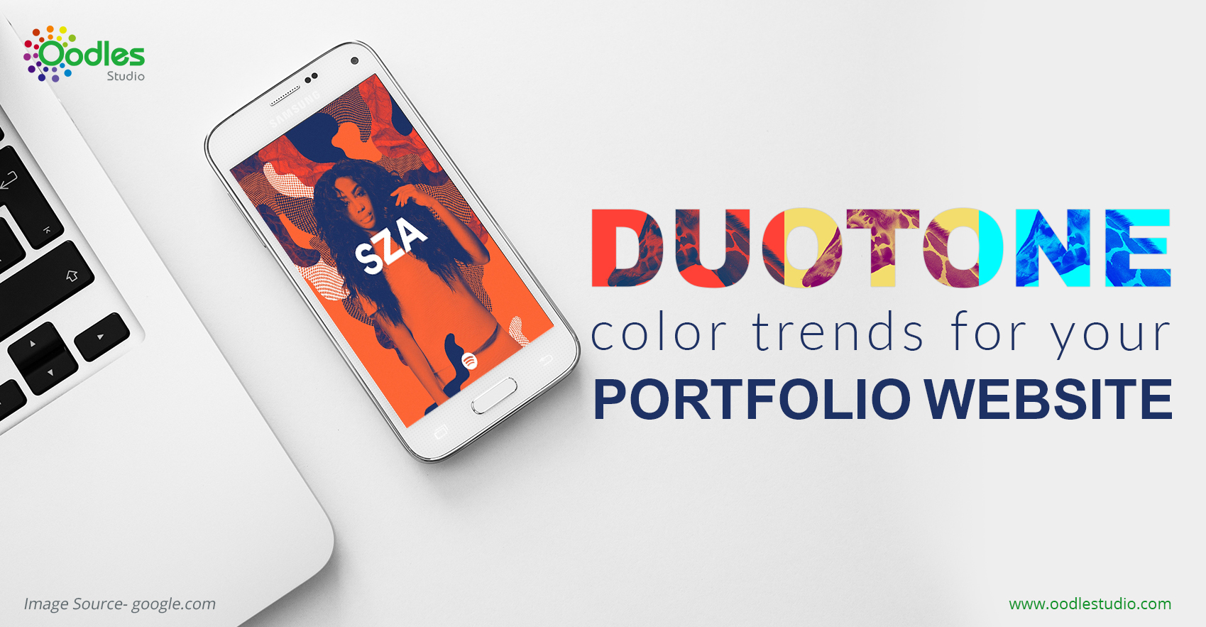 The picture above is a great case of how this basic yet striking system can be utilized for an extraordinary impact, especially when combined with solid, moderate compose (more on this quickly).
Duotone shading plans are unimaginably flexible and exceptionally compelling, in spite of the predetermined number of hues in play. There are various approaches to utilize duotone shading plans on your blog, so make sure to investigate diverse plans previously settling on the last decision.
The picture above is a great case of how this basic yet striking system can be utilized for an extraordinary impact, especially when combined with solid, moderate compose (more on this quickly).
Duotone shading plans are unimaginably flexible and exceptionally compelling, in spite of the predetermined number of hues in play. There are various approaches to utilize duotone shading plans on your blog, so make sure to investigate diverse plans previously settling on the last decision.
Steps to create your own Duotone color tone images:
- Pick a correct Image: It is a more crucial step to select a perfect High-resolution image for your websites because If you pick wrong images, Duotone effect won’t show up strongly. Some tips to select correct image for your website
- Always pick High-resolution image.
- Always try to pick those images which have large no of the color palette.
- Avoid images which have Larger areas of Black, violet and dark tone color because they will become over highlighted.
Create flat color Rectangle: Create a rectangle on your image, fill it with a color you want to highlight in your duotone image, you can also try to use gradient colors as well.
Use opacity: Now use layer opacity on the rectangle you have drawn, make it up to 55 % in opacity settings.
Use Hard mix Blend Option: Last but not the least Use “Hard mix” layer blending option
This will give final effect to your images. After that, it's up to whether you want to use those images directly in your portfolio section or You can also adjust final images edits by playing in rectangle opacity. I Hope this technique will help you make your own website successful than others.
Shubham Pachauri
08 Feb 2018
Why We Use Isometric Illustrations In-App Walkthrough
 Last 5 years were being a great era for mobile application. In very short time large numbers of businesses moved to the Online platform and this process is continuously running and getting faster by each passing day. In the middle of all this mobile application are becoming the first choice for all businesses. It is the most common way to increase sale and improve management for all kind of businesses.Now with this problem arise which we going to discuss today on this blog. By increasing no of application in the market competition level is also increasing. Every individual business is in a race to surpass each other in the race of having maximum happy customers with the performance their application. So their application has to be the best on every parameter. But the race for any application starts from the very beginning by their first impression on users.
Everything depends on the facts that whether that, Whether the app able to convey its “Purpose of existence” to users from very beginning. This serious task is not easy to achieve. There are thousands of application in the market which build perfectly to solve their task but users choose to use other Application because they just not know how much this application can help them for their specific task. Now luckily we have UX artist in the market who are bringing revolution in application market by improving the User experience of applications. Let‘s discuss ‘walkthrough’. One of the solutions suggested by Ux artist which can help us to provide information to users about the application from the very beginning of application architecture.
Last 5 years were being a great era for mobile application. In very short time large numbers of businesses moved to the Online platform and this process is continuously running and getting faster by each passing day. In the middle of all this mobile application are becoming the first choice for all businesses. It is the most common way to increase sale and improve management for all kind of businesses.Now with this problem arise which we going to discuss today on this blog. By increasing no of application in the market competition level is also increasing. Every individual business is in a race to surpass each other in the race of having maximum happy customers with the performance their application. So their application has to be the best on every parameter. But the race for any application starts from the very beginning by their first impression on users.
Everything depends on the facts that whether that, Whether the app able to convey its “Purpose of existence” to users from very beginning. This serious task is not easy to achieve. There are thousands of application in the market which build perfectly to solve their task but users choose to use other Application because they just not know how much this application can help them for their specific task. Now luckily we have UX artist in the market who are bringing revolution in application market by improving the User experience of applications. Let‘s discuss ‘walkthrough’. One of the solutions suggested by Ux artist which can help us to provide information to users about the application from the very beginning of application architecture.
What is Walkthrough?
The walkthrough is those 3- 4 screens ( according to application need ) which come at the very beginning of application for the first time users just after splash screen. These screens help us to understand the purpose and usability of the application.In these screens created mentions all the tasks and functions which can be performed by their application easily. Now we know that app walkthrough is a really useful method to improve application interaction and retention among users so now let's discuss how we can even improve this method to next level now by the experience we know that the motion graphics are the best ways to conveys messages. So by this motion graphics a new technique emerging in a market which is called Isometric Illustrations.What is isometric Illustration?
Basically, the isometric illustration is the same vector illustration which we are using traditionally but now it also has z-axis in their appearance. Basically, it is 2.5-dimensional vector graphics.Now let come to our basic question from where we begin our topic:Why we use Isometric Illustrations In-App Walkthrough?
As we know so far the importance of the first impression in the application and the basic of isometric Illustration now if we combine these two-term we will get an answer that how we can use Isometric Illustration to improve our application interaction with users. Here some tips:- To convey theme: You can use isometrics illustrations to convey the theme of your business with users as they are great way to present your information in front of normal users
- Isometric with animation: Isometric Illustration can also be used in motion graphics form. In this form, they become a more powerful tool to interact with users. As motion graphic scientifically more easy to remember the form of information.
- Eye catchy: It is one of most eye catchy form of art in Vector graphics league.These graphics can attract users from the middle of hundred’s other options.
Shubham Pachauri
07 Feb 2018
Sketching With Free Hand And Digital Tools
Many believe that Being a Sketch artist is god gift, It can't be achieved no matter how hard you try without this gift. But this is the completely wrong assumption, Being a sketch artist is not an impossible task if you hardworking and dedicated to it. Let find why you need to learn to sketch, Is it really necessary or not For me these reasons could encourage you towards the sketching.

- If you related some Creative field like Graphic design, Architecture, Illustrator artists, Animation artist and VFX artist and many more.
- It can be your hobby No matter from which field you belongs to.
- You might need it to express your ideas.
Some tips By which you can Improve your Sketching Skills:
-
Gathering the ideas and Inspiration: “ No Art Piece can start with an empty mind ” First you need to collect all Reference stories (sketches and Illustration ) related to your artwork, this will help you to create a basic physical structure which consists theme, color schemes, character properties and its presentation.
-
Setting up a Document: While working on a Wacom bamboo Setting up a document is a crucial part You need to work on 300 PPI and RGB color format as it is good settings for all kinds of devices and also adaptable for lithography.
-
Avoiding White sheet panic: While looking at your white empty document in monitor sometimes you started to frustrated as you don’t know where to start this situation called white screen panic.To avoid such situation fill some color in the background I prefer these #fff8c9 or ffe6ce. This will give a more clear picture of your illustration.
-
Using layers for different elements: Today when we create some Illustration It contains multiple elements in multiple layers as compare to old days when we used to draw sketches on paper. Now we have more Flexibility cause we can redo or edit any part on Illustration any time as It has its unique layer.
Shubham Pachauri
29 Dec 2017
Using SVG icons In replace of Tradition PNG format
Although using SVG icons is not a new technology but Still, It is not popular among designers and developer. But we should use it as our primary option. let discuss some best feature of SVG format and why should we use it:

-
SVG is crisped in nature:
SVG utilizes a facilitate plotting framework to plot indicates and associate them draw lines, shapes or ways. Vector designs are drawn utilizing arithmetic, which means they're sharp and fresh, not pixelating like other picture positions, making them incredible for logos, symbols, and illustrations.SVG has various different highlights, as well – with channels, examples, angles and concealing and the 'viewBox' property for surrounding the scene – and they're all can be energized. SVG is to a great degree flexible and bolstered by all programs going the distance back to IE9.
-
Accessibility:
SVG has labels fabricated particularly for availability, the fundamental one being the '<title>' tag. The title follows alongside the '<desc>' tag ought to be utilized to give fallback substance to screen perusers. The substance of these labels won't be shown by the program however they will be presented to the programs availability API. You can (and should) likewise utilize the right ARIA properties where pertinent, for instance, in case you're concealing an SVG component.
-
It can be animated Easily:
Components inside SVG can be enlivened to make some really astonishing intuitive encounters or the activity can be utilized to add decent little touches to an interface, picture or symbol. Liveliness can be made utilizing CSS, the Web Animations API in Javascript or utilizing the SVG '<animate>' tag. SVG activity is at an intriguing point being developed. Google expostulate SMIL – SVG invigorate tag – in Chrome 45 for CSS liveliness and the Web Animations API yet has since suspended the belittling.
-
It's interactive:
Using Javascript we can interact with elements inside of SVG, thanks to the navigable DOM. This allows us to create interactive elements using SVG the same way we would with HTML and CSS.
Shubham Pachauri
29 Dec 2017
Best Plugins For Photoshop
Although Photoshop has all new updates a graphic designer ever wanted If you looking for some plugins to help you in your design work to make you more time effective and accurate with Your creativity. There are many plugins available in the market which can help you. Let's discuss some of them.
Eye candy:
Eye Candy has been around for over 10 years, with form 7 offering an expansive scope of impacts going from flame to chrome, glass to expulsions. Valuable for a wide range of situations, a considerable measure of the impacts require dialing down from the default settings to accomplish an option that is other than a mushy outcome, yet there's a lot of shrouded jewels in the suite.Filter Forge:
Filter Forge offers 12 thousand of impacts and surfaces, covering relatively every utilization case you can envision. Invariant 7.0, the new duplicate glue work makes it conceivable to utilize Filter Forge with any host. Simply duplicate a handled picture from the independent Filter Forge application and glue it anyplace you need. Need to work with render channels? Presently you can review every single dynamic channel amid rendering and fare every one of them to documents on the double. Find all the new highlights here.RH Hover color Picker:
In the event that you've at any point longed that Photoshop's shading picker was only somewhat less monstrous and bulky, Rico Holmes' Hover Color Picker may be what you've been sitting tight for. It's there when you require it with an attractive arrangement of customizable sliders that give you significantly more control than the standard picker, and when you're setting it'll limit itself consequently.Ultimate Retouch panel:
For proficient modifying comes about that go a ton more remote than the default Photoshop channels, it's difficult to turn out badly with Ultimate Retouch Panel. Presently on form 3.7.5, the designer's been accepting proposals from ace customers about what they require from it, and it includes more than 200 capacities in a single board, including seven recurrence detachment strategies, four quick correct techniques, and 15 instruments for nearby modifying.
ALCE 3 :
Neighborhood differentiate upgrade is a valuable strategy for bringing out additional points of interest in photography, and keeping in mind that you can do it in Photoshop utilizing the Unsharp Mask channel, it can be a bit hit-and-miss on the off chance that you don't generally realize what you're doing. ALCE 3 removes all the mystery from it, adding shape and profundity to your shots without losing a point of interest crosswise overshadows and features.
Shubham Pachauri
29 Dec 2017
Glowing Text Effect For Christmas
When it comes to Christmas, it is the biggest event for a graphic designer and web designers. We all engaged in making graphics for this event especially if you are from the E-commerce field.
 And one of the most trending thing in this period is Neon glowing effects in the text. This text effect is most common in Christmas and new year related Posts, Banner Advertising, and e-commerce related graphic content as it represents joy and happiness. Here we will be discussing how we can create such effect in some easy steps.
And one of the most trending thing in this period is Neon glowing effects in the text. This text effect is most common in Christmas and new year related Posts, Banner Advertising, and e-commerce related graphic content as it represents joy and happiness. Here we will be discussing how we can create such effect in some easy steps.
-
Start selecting font
selecting the font is first and most important part of Creating Such kind of glowing effect because need a font Which is sleek in look and rounded in corners otherwise glowing effect will not look good if you use some strong and heavy text. As you see the neon light are cylindrical in shape most of the type. My choice for this type of effect is Stellar or gravity font. You may find the different better font for your work.
-
Pick right colors and background:
Choosing right background and color is also very important part Glowing effect will not look cool if you missed the right color combination. For background, you should always use dark colors as they highlight your text part and for text, I prefer these colors #e82222, #8cef5b and #6ac5ff.
-
Combination of Blending Option:
For creating neon and glowing effect you need to add Multiple Blending Option of text with different effects : -
Add glow:
To perform this you need to apply a glowing effect on text, to do this Double right click on your layer to open blending layer options select outer glow and make these Setting: Opacity 50%, Spread 5% and the size of 63 Pixels.
-
Add Bevel and Emboss:
Now from same blending Option Menu Choose bevel and emboss and Make these setting Depth 100 %, Size 5 Px and Soften 2 Px. Now your text will start to look like neon light.
-
Glowing layer:
Now make a duplicate of your text remove all layer effect, this layer will behind your base text layer now Apply Gaussian blur on this layer with 4 points. To make your alphabet glossy in feel as same as original neon light tubes look like.
-
Detailing:
Until this point in time, your text will start looking like neon lights but now you need to add some more details. First, add some inner glow with bright color and also add some drop shadow but not too much.
Shubham Pachauri
29 Dec 2017
Preparing Assets For After Effects
While working on some motion graphic you need some Illustrator assets to work on and they need to be created according to ease of animation but many times we ignore some basics points which need to be followed. Few basic mistakes we commonly commit are:

- We create one giant layer of multiple graphics element which creates problems when we try to move them flexibility.
- Many time we choose the wrong color profile for our assets.
- Sometimes we create assets of the wrong size.
-
Using layer panel smartly:
When we work in Illustrator we usually create all content in a single layer and make it as a single group this create problem while animating such content in after Effect because you can’t animate an object freely if its layer is not separated. Let say an example If you want to animate a logo with multiple letters but they are not separated then you control them in After Effect for multiple animations on the different letter at the time you need to separate letters from each other to animate them properly.
-
Size of Artboard and its content:
Size of artboard matters when you working for After Effects assets. Let's understand it by an example If you have artboard of size 40px-40px and your graphic inside it is also 40px-40px then this will create a problem when you need animate this graphics by resizing its small size it might cut your graphics edges by some pixels. To avoid this always create your artboard more than your graphic.
-
Correct color format:
When you are working for After effect always save your graphics always in RGB color mode because your moving content never going to print so CMYK color mode are required you can change color mode from File >> Document Color Mode >>RGB.
-
Importing Asset in After Effect:
Now, this the final step Which needs to be done correctly or all your step was taken above will be waste of time. Now go to File >> Import >> File Now select the “.Ai” file which you have formatted correctly with steps mentioned above. Now select Kind type to “composition” from promoted Import menu this is important because if you select kind type “footage” all layer will combine again into a single layer. So avoid that common mistake.
Shubham Pachauri
29 Dec 2017
Do You Like Or Dislike The Criticism Of Your Design Work
Designing is a creative process in which a designer creates a piece of work with his unique
approach of thoughts and with the help of designing tools available for him. A designer
never leaves any factor unconsidered while creating UI or any design he is up to. But even after that sometimes we left many important factors untouched. In fact, when someone tries to assist us on those untouched factors we start defending our work. I mean
it is a good thing that we should always defend our work and should have the best explanation for our
design. But, we should also consider everyone's views because ultimately we are making
a product for them. Designer are humans too, they also make mistakes. It is not always
easy to accept their view, however, we should accept them in order to be more better than before.
In fact, when someone tries to assist us on those untouched factors we start defending our work. I mean
it is a good thing that we should always defend our work and should have the best explanation for our
design. But, we should also consider everyone's views because ultimately we are making
a product for them. Designer are humans too, they also make mistakes. It is not always
easy to accept their view, however, we should accept them in order to be more better than before.
Here are some ways in which critics can be very helpful:
1) Listening to Feedback:
Feedback is a very important part in the design process. It can take your design in a right direction or in a wrong direction. But, unless you don't listen to them you won't reach anywhere. Instead, you should always try to improve your creative approach to work and this can be done by listening to others feedback about your design. It can make you more accurate with the design.2) Understanding the UX:
Understanding your user's problems and expectations is one of the most important parts of designing. And the process of this understanding can only be achieved through listening to the critiques suggestion and thoughts about your design.3) Be curious to listen to any audience:
Every designer has their own way of designing, same as every user have its own problems and expectations with products. The designing process does not end with completing and launching the product in the market. Between the updates, a designer should have the capability to listen to others more than defending his own work. A great suggestion can come from anyone so a designer should focus on every user's thoughts. This will definitely help them in their own growth as well as it will be good for the product. To conclude, a designer should always keep his mind more opened to criticism rather than defending his work.
Shubham Pachauri
29 Sep 2017
The Importance Of Being Organized As A Graphic Designer
Today we are living in an IT revolution era. New technologies are taking their shapes and reshaping
the designing landscape. We are seeing great competition among IT companies to maintain their leadership in
the market as tech experts. And, in that manner organizations are putting their efforts to make their
employees more efficient and productive. Now let's specify this employee part. We are talking
about graphic designers. In order to be more productive, a designer generally starts losing his
creativity, which is the most precious thing for a designer. It makes him different from the other
minds. So, now the question is how to keep fuelling your creativity in such environment. Simply, become more organized than before," it will help you anyway.
Let's talk about them one by one:
Creating the overview of variable factors in a project:
Generally, when we try to work faster as a designer in a project, usually, we end up with multiple colors, different shades of the same colors, and multiple font styles. That's definitely is not a smart way to work. Thus, avoiding such disasters create all sets of variables before starting the work on projects.Grouping and renaming layers properly:
Remember, when you have to work on some others designer’s PSDs, you may get frustrated while working on them because you have to make efforts trying to find every small object and layers. When we forget to organize our work while working on graphics, it might be organized for us. But, when someone else works on that, they will deal the same problem. So start organizing your PSDs from now because that will save you lots of time in the future.Keeping your files organized:
Have you ever found yourself in trouble finding the latest updated PSD of your work? Frankly, I had a very bad habit of keeping files unorganized all over my desktop, in different folders of my system. And it had wasted my precious time. However, now I keep my files more organized than before so that when I need to find something urgently, I don't have to waste the time on searching them. Now I know where I am keeping my files. This way by putting a small amount of time and presence of mind, you can save lots of time for yourself. These are the methods I use to organize my work in order to be more creative, efficient and productive for my organization.
Shubham Pachauri
29 Sep 2017
Importance Of Enhancing And Fueling Your Creativity
 First of all, let's discuss what is creativity. For me, creativity is the thinking skill that makes you slightly different from others. If you are a creative person than you will see every problem like a new opportunity. Not only in designing but creativity will also help you out in your daily life problems. But let me clear one thing very clearly It is not a gift you get from a day of your birth. Actually, this is a state of mind which you achieve by putting lots of hours of hard work into in concern field of work or activity. And a state of mind can be faded by passing time if you are not fueling it.
First of all, let's discuss what is creativity. For me, creativity is the thinking skill that makes you slightly different from others. If you are a creative person than you will see every problem like a new opportunity. Not only in designing but creativity will also help you out in your daily life problems. But let me clear one thing very clearly It is not a gift you get from a day of your birth. Actually, this is a state of mind which you achieve by putting lots of hours of hard work into in concern field of work or activity. And a state of mind can be faded by passing time if you are not fueling it.
So let's talk about how creativity can help you out:
Creativity gives you flexibility:
Today in any office you will feel one thing in common you have to do hard work to achieve your goals and target. Now here Creativity can help you as one of the goods of being creative is you become more focused than others.So you can work more freely on multiple tasks as you are so focused on every task.Creativity increase productivity:
Being creative means you have a better approach towards problems that means you can bring solutions to problems quickly than others so you will ultimately be more productive than others because you have the ability to do more quality work in less time.keeping you ahead in competition:
Today competition is everywhere no matter what is your field of work you will find people besides you trying to take over You but creativity will make you different than other. You will pass them easily if you are creative enough.Creativity keeps you motivated:
One of the common problems found among designers is that after some years of work they get bored with their job the reason behind its lack of fun in work. but a creative designer is completely different than others they always keep them motivated and focused on finding their passion in doing things in their own way.
Shubham Pachauri
29 Sep 2017
Presentation Is The Key To Successful Attempt
The presentation is very important part of designing. It is same important as designing something. Presentation skill can come very handy in any business but In the designing sector, it is important to present your work in a manner so it can be selected by clients in First attempt. Here is the few trick I used to use in my work presentation.

Use of mockups:
While working on logo and Boucher. Every designer faces one common problem which is, It is hard to predict that how logo and Boucher will look when it comes to the final printing stage. Even the client couldn't able to pick his brand identity from multiple logo images. At that time use of mockups can help you a lot. with the help of these mockups, you can place your designs inside some real looking object images of visiting card, hoardings, magazines, CDs covers, t-shirt and much other stationery. Now, these images can help you get that idea how your design will look in the final stage of printing. Even now clients can understand your ideas and thoughts easily when they see their product identity in final stage directly. This way you can get their approval faster on your design thoughts.Using wireframes and prototypes:
While working on some software or applications designs for a client who lives hundreds of miles away from you. It was difficult to explain your ideas to a client but now we have tools like marvel, axure, Just in mind and proto.io. these are the tools available for prototyping and wireframing. They can be used to provide a basic blueprint of products. They are easy to operate so even clients can use to share their inputs on blueprints through such tools. It wasn't possible earlier with hand-drawn wireframes. Earlier it was very hard to bring client on the same page you are thinking But now these presentation tools can help you find the way for better communication with clients. The presentation doesn't mean giving long product launch speeches or decorating files with multiple colors. It is just the medium for you to convey your thoughts or design in a better manner with strong reasonable points. You can use these methods to justify your hard work you have put behind your design you can present your work better with these tools.
Shubham Pachauri
29 Sep 2017
Misinterpretation among designers about Sketch.
sketch is a awesome software available on Apple’s Mac from about 7 years now. Almost half of the web designer and graphics moves to this tool. But Still lots of designers not using it because of lots of misinterpretation about this awesome tool in a market. Let discuss some of them:
- It's not only for Wireframing: Yes, we can do wireframing in it but that's not all, you can design your applications and website from scratch by spending less time and efforts as compare to Photoshop or illustrator.
- Many of us still think In sketch we can only drag and drop: Sketch provide lots of useful asset within it like Icons, templates for applications and websites screen. buts that not all sketch also gives you tools to create new innovative designs Just like any other designing software.
- It Will take time to learn this software: Many designers not using sketch because they think they have to spent lot of time to learn this software. But It is quite apposite you don’t need any special class to learn this software. This software have very easy interface. Its works on same layers system as Photoshop.
Shubham Pachauri
30 Jun 2017
Adobe asset library and pexel plugin
Adobe creative cloud's gives you Freedom to save your assets online. This option comes very handy while you are working in a field where you have to work fast in order to proves your productivity. At that crucial time you can use this awesome option you can save assets in cloud library which you use very often in your projects. So next time when you need those asset you directly drag from cloud library with all its layer and properties.
Things you can do with adobe library:
- You can templates: Sometimes we repeat few sets of designs properties in our all our projects. In Adobe creative library we can save them as a templates. So Whenever You need them in future you can drag those templates into your project directly.
- You can save fonts: Sometimes we use new fonts in our project. And when we share to some other designers or any concern other person. It is not editable by them as they don’t have that font. But if you save your font on creative cloud you can share that font directly with all other concern people through creative cloud.
- Can access from anywhere: Anything you save on creative cloud with your registered Adobe id. You can access it from anywhere you want with any of your machines. You just need to login with your adobe Id.
Shubham Pachauri
30 Jun 2017
Using smart object in Photoshop
When we talk about smart objects most of us think that it is the group of layers which we create
to save our layer from distortion while transforming object in Photoshop. And it is correct also but
this is just a small part of smart object feature and use. Actually smart object saves lots more than that.
Few uses of smart object:
Saving icons as smart Object: While working in Application and websites we use lots of icons in it and sometimes we have to resize them also but they gets rasterize while performing transformation. To tackle such situation we can take help of smart object. We can save our icons in large size inside smart object so in future we can resize it without any fear of distortion or blurriness.
Smart object saves layers Properties: Sometimes we need to apply Blending effects on Groups of layers. So we rasterize them. But then we realize that we have to make changes in those layer’s groups at that time we can’t do anything on that. This situation is very frustrating because now you have to make those layers again from start. Now Smart object can save this problem you can convert your group of layer into a smart object to apply any blending option on it at the same time you can make any change in this by double click on smart object layer.
Smart objects from illustrator: Smart object also save data from Adobe illustrator. Means you can design some complex vector project in Illustrator and later you can use them in Photoshop file as smart object by just dragging them in Photoshop from Illustrator. This ways your vector Project will always be editable inside Photoshop smart object layer. You just need to double click on it and you will be redirected to Illustrator Where you can edit it the way you wants and the Changes will appear in Photoshop at same time.
Smart object are useful exporting process: Smart Object can help you save your time while exporting files. Exporting cropped files is very time taking and boring process but we all have to deal with it. And then we start searching for short cut like “Batch Process” but for that we need to identifies layers which we need to export in batch process so we convert them in smart object.
Shubham Pachauri
30 Jun 2017
Adobe kuler most Underestimated tool from Adobe
Adobe kuler is one of the adobe’s best tools available for free Since 2006. which is widely used among designers for picking best colors for their Application and websites. But many designer still Don’t Know about It. Probably Because It is “Free”.
Few Advantages to use adobe kuler:
Directly Connected with Adobe Creative Cloud: Adobe Kuler color swatches can be open in Photoshop or Illustrator as they are connected to each other through creative cloud. So If you save one color swatch in Adobe kuler you can also open it in other two applications too and the best part they are saved on cloud so you don’t have carry your machine everywhere. These swatches can be access anywhere on any machines by just login with your registered email id.
You can pick colors from images: By uploading any Stock Image on Adobe Kuler you can extract its color in a color swatch which can also be saved on creative cloud.This option is very useful while you are create project In which You are using lots of images and you need colors which can relate to your project theme. At that you use Adobe kuler to pick color swatches for your project.
Color Swatches From Other Designers: By Exploring on Adobe Kuler You Will find some really cool color swatches Which are uploaded by other designers.You can download them. And also you can interact with those designers by commenting on those swatches if you have any query about those colors.
Experimenting color swatches : Adobe kuler provide different type of color wheels In which you can you experiment with your choice of colors for your project you enter your color code in it and then you will be avail to check other related color codes on a wheel which you can modified their. And then they will be available on you all creative cloud application.
Shubham Pachauri
30 Jun 2017

Don't just hire talent,
But build your dream team
Our experience in providing the best talents in accordance with diverse industry demands sets us apart from the rest. Hire a dedicated team of experts to build & scale your project, achieve delivery excellence, and maximize your returns. Rest assured, we will help you start and launch your project, your way – with full trust and transparency!
